品牌形象
SMOORE思摩尔

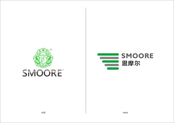
SMOORE思摩尔作为众多国际著名烟草品牌在中国的核心代工企业,历经九年的励精图治成长为电子烟行业的领头羊。2014年3月创业板上市前夕,委托彦辰设计对其原有的企业形象进行革新。
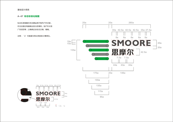
原有企业形象缺乏行业特征,无文化关联度、产品粘合度。为此彦辰对其进行了系统性的梳理、审慎的策划与颠覆设计,将原有欧洲绶蔓式样的冗繁陈旧形象简化为五条杠、五支烟的抽象图形,这个图形来源于彦辰为其提炼的五个英文缩写为I的企业理念,显现出其产品研发数据监测动态意象,更象征企业节节高升的美好愿望,体现企业的活力与朝气。
SMOORE who has nine years experience and accumulation in electronic cigarette OEM industry for lots of famous brand and become the leader in this industry.In January 2014,ahead of going public,entrust Iseead to reform its original VI.
SMOORE old corporate image is short of industry characteristics and no culture expression.So Iseead make the systematic carding and analysis,careful planning and reverse design,delete the old miscellaneous ribbon style and revise to simple five cigarettes of abstract graphics.At the same time,implied five meaning of corporation.The traditional way of graphical representation have been subverted.The whole VI shows dynamic image.The significance of the scientific and standardized the product research and development,give a person a dynamic visual experience,embody the vigor and vitality of the enterprise.


来源:彦辰设计www.iseead.com


